Your Prices Are Talking. Are They Saying What You Meant?
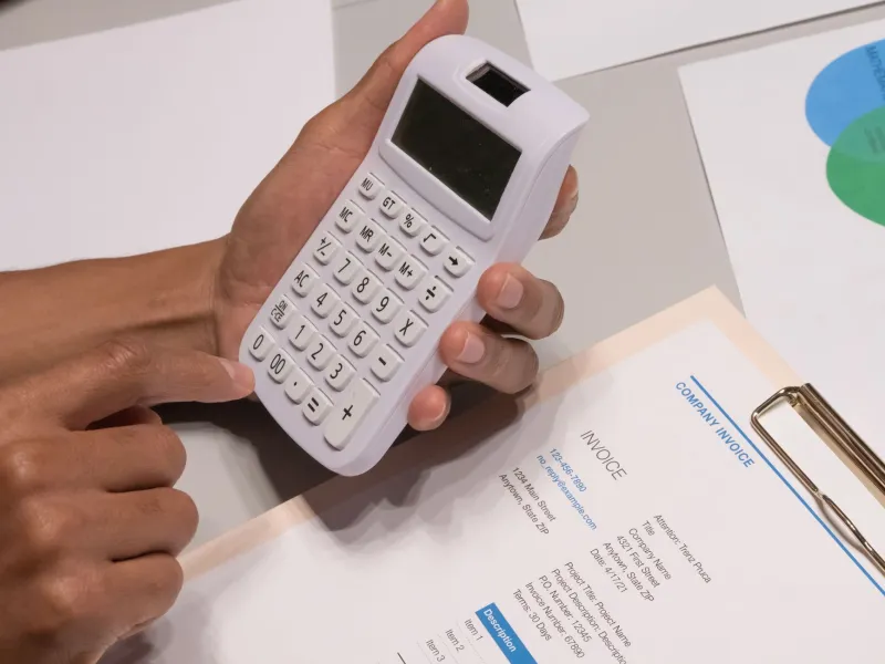
Most pricing conversations start with the wrong question. Should it be £950 or £1,050? Should we add a zero? Should we put 'from' in front of it? All fair questions, but they skip the bit the customer reads first. Before anyone reacts to the number, they react to the shape around it. The tiny VAT note. The payment terms in grey. The crossed-out price. The bundle table that looks like a train timetable. Your price is not just a figure. It is a sentence, and customers are reading it whether you edited it or not.
At The Think Shop, we like an audit that costs nothing but a printer and a bit of honesty. This is one of those. It is not about being the cheapest or the cleverest. It is about making sure your numbers say what you meant before the customer starts guessing.
The number arrives late
Think about the last quote you sent. The customer probably scanned it in this order: your name, the job title, the total, the VAT line, the payment terms, then maybe the detail. If the total is clear but the terms are buried, they will assume the worst. If the price says 'from £500' with no clue what pushes it upwards, they will assume the top end. If the invoice has a different layout from the quote, they will assume someone got sloppy.
None of this is about honesty, necessarily. It is about reading order. A price list is a small decision-making document. The customer is trying to answer three questions: what do I get, what do I pay, and what happens next? If your layout makes them hunt, you have added friction to a decision that was already difficult.
VAT is not a footnote
UK pricing has a special talent for turning a clear number into a quiz. Is that price inc VAT or ex VAT? For consumers, the displayed price should normally be the price they actually pay. For B2B, ex VAT is common, but it needs to be obvious, not a tiny note near the footer. 'Plus VAT' in 9pt grey is not clarity. It is a trap for the hurried.
If you serve both audiences, show both. A simple line such as '£1,200 plus VAT (£1,440 inc VAT)' removes the mental arithmetic. On invoices, make the VAT breakdown visible and boring. Boring is good here. The customer should not have to reverse-engineer your arithmetic to trust you.
Payment terms are part of the price
A price without terms is only half a price. '£2,400' feels very different depending on whether it is due today, in 30 days, or in three staged payments. A deposit changes affordability. Card fees change the final number. A monthly retainer changes the commitment.
Put the payment story next to the price, not in paragraph nine. The customer should be able to answer two questions at a glance: what do I pay now, and what do I pay later? If the answer is 'it depends', say what it depends on. Vague terms do not feel flexible. They feel like risk.
Bundles need a spine
Bundles are supposed to help people decide. Too often they create a new problem: three tiers, fourteen bullet points, and a 'most popular' badge that feels suspiciously well placed. The customer ends up defaulting to the cheapest option because they cannot work out what the difference is.
A good bundle has a spine. Each tier should be explainable in one sentence. If you cannot say 'the middle one is for businesses that need X but not Y' without checking the table, the table is doing too much. Framing matters, but it should frame a real choice, not manufacture confusion and call it premium.
Discounts are loud
A discount is a signal before it is a saving. A red strike-through says 'this is a deal'. A countdown timer says 'hurry'. A permanent 20% off says 'our real price is probably lower'. None of these are automatically wrong, but they are all saying something. Make sure it is what you meant.
If you discount, show the saving in a way a human can read. 'Save £150' is usually clearer than '15% off' because it names the actual money. Show the final price as prominently as the old one. State the conditions without hiding them. And if the discount ends, end it. A deadline that quietly moves is not urgency. It is a small trust leak.
The price-list readability test
Here is the simple version. Take your quote, service page, menu or invoice. Print it, or view it at actual size on a phone. Then run these checks.
-
The thumb test. Cover every digit with your thumb. Read what remains. Can you still tell what is being sold, who it is for, what is included, whether VAT applies, when payment is due and what the next step is? If not, the layout is carrying too little weight.
-
The ten-second squint. Uncover the numbers and give someone ten seconds. Ask them: what is the total today, what is due later, what is optional, and what is the cheapest sensible route? Note where they hesitate. Hesitation is your edit list.
-
The read-aloud test. Say the price block out loud. 'From £750 plus VAT subject to survey' is a sentence that makes sense to you and a riddle to everyone else. If it sounds like a legal disclaimer, rewrite it.
-
The mobile check. Most quotes and menus are opened on a phone. Does the table collapse into nonsense? Does the VAT note fall off the bottom? Does the 'book now' button sit miles from the price? Fix the small screen first.
-
The invoice mirror. Compare the invoice to the quote. If the final bill looks like a different company wrote it, the customer notices. Consistency is a quiet form of respect.
What good looks like
Good pricing presentation is not flashy. It is calm. The total is easy to find. The VAT position is stated once, clearly. The inclusions are short enough to scan. The payment terms sit close to the number. The next step is obvious. There are no surprises waiting in the footnotes.
That might sound like basic admin, but it is marketing. Every price list is a tiny piece of brand behaviour. It tells the customer whether you are organised, whether you respect their time, and whether the final bill will resemble the first conversation. The number matters, of course. It always does. But the sentence around it decides whether they trust the number enough to say yes.